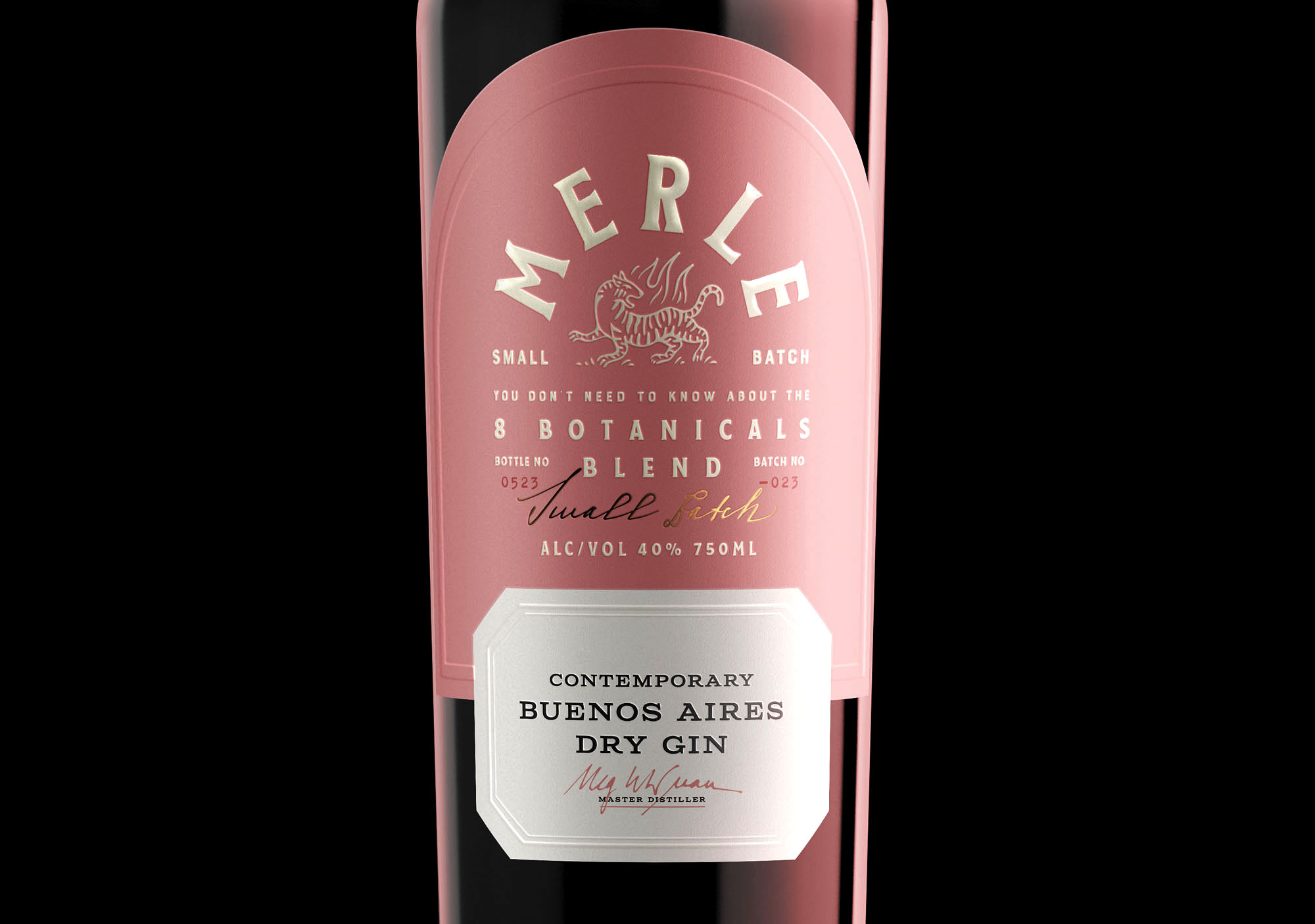
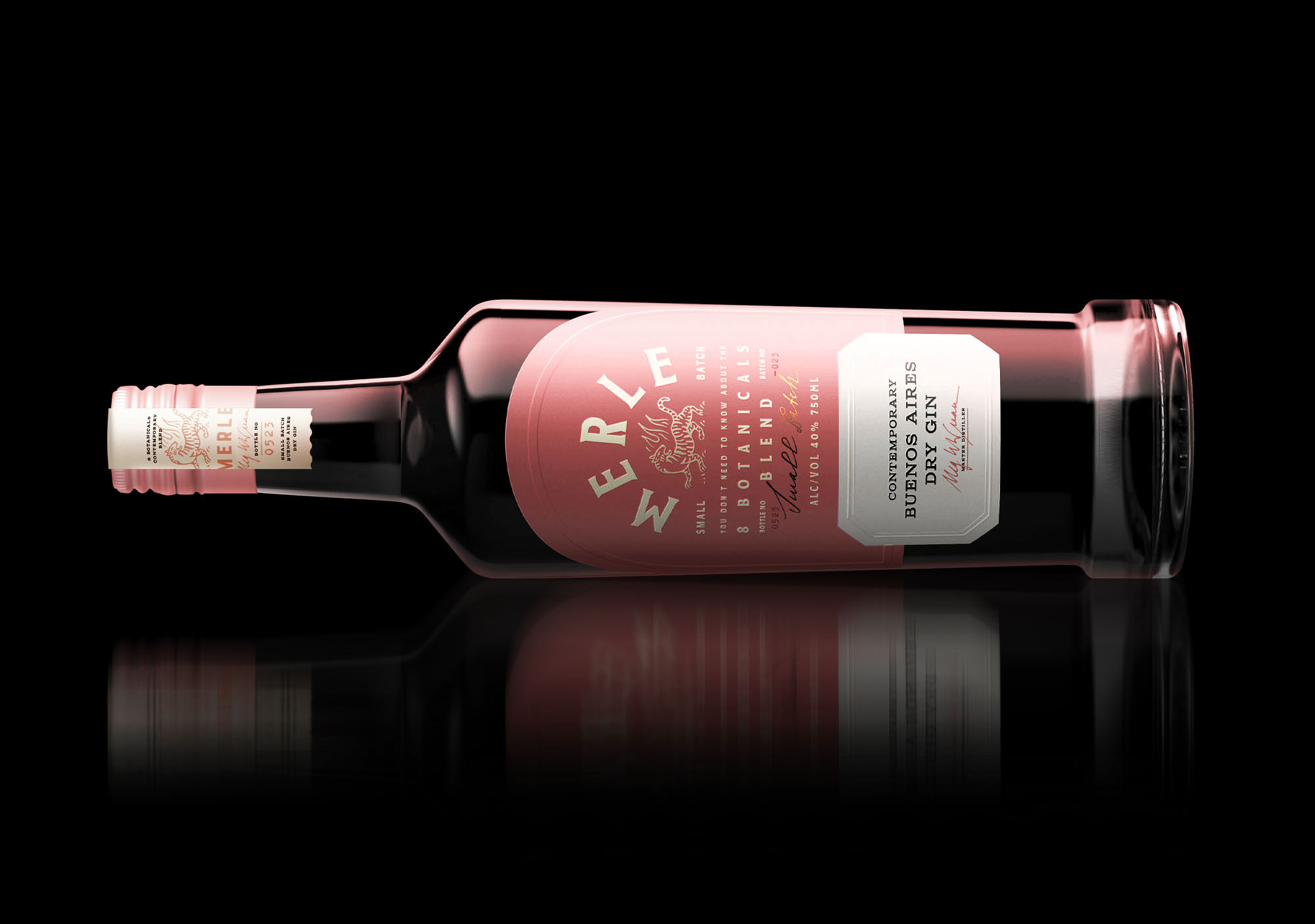
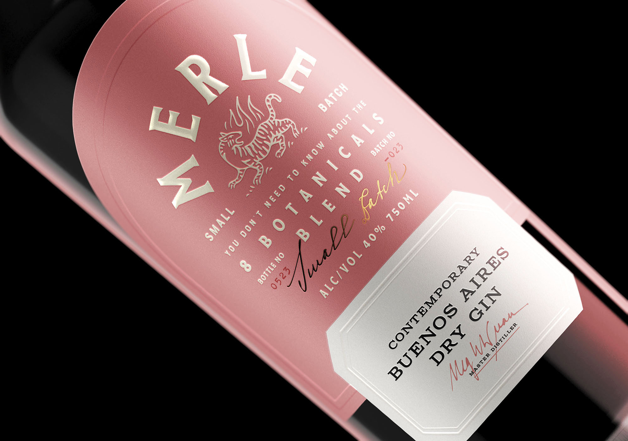
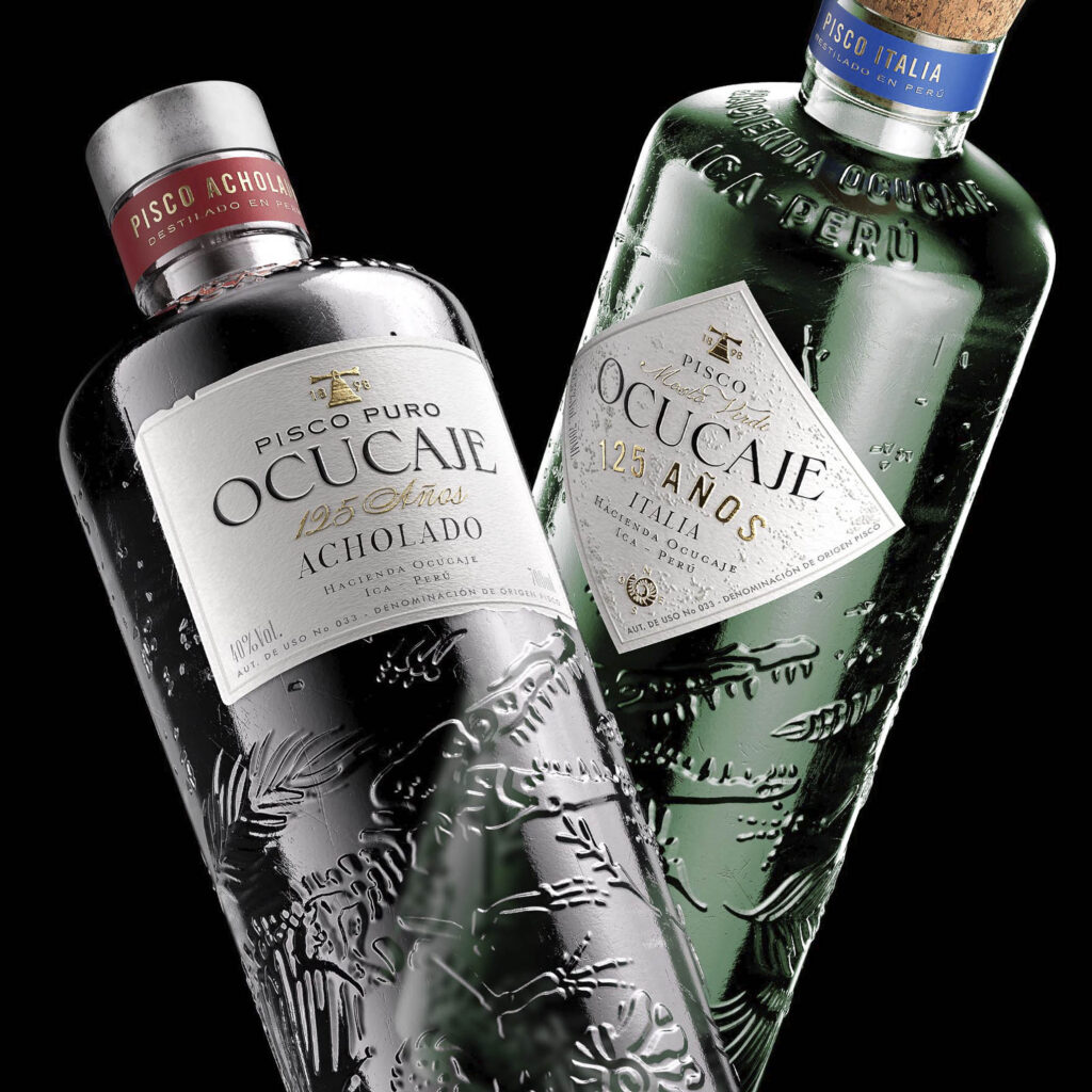
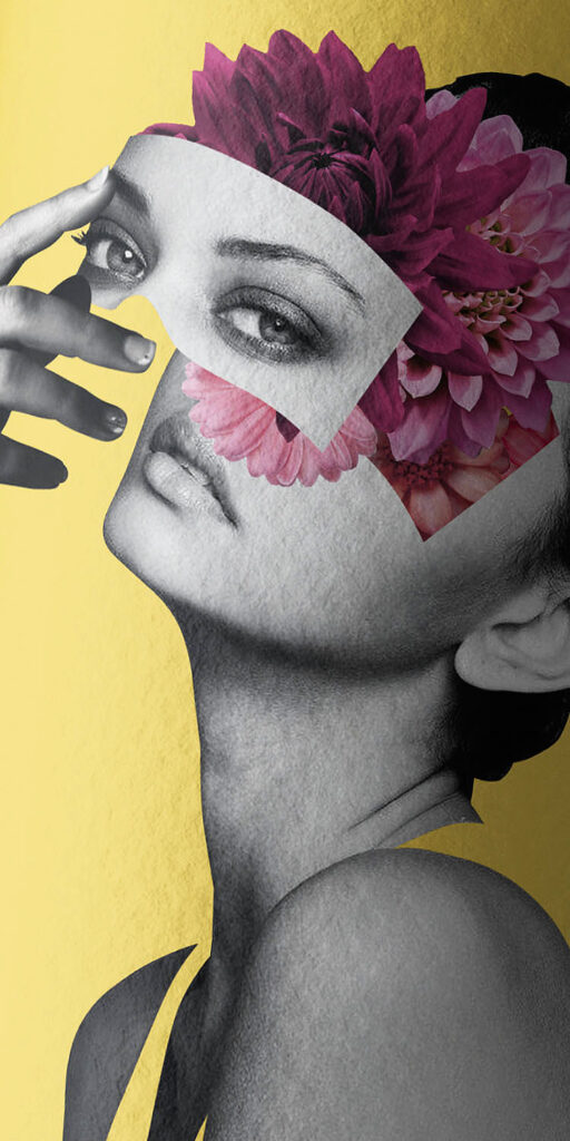
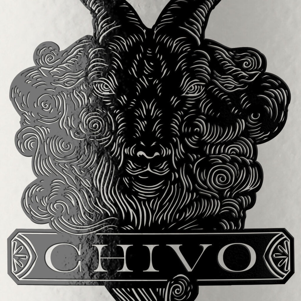
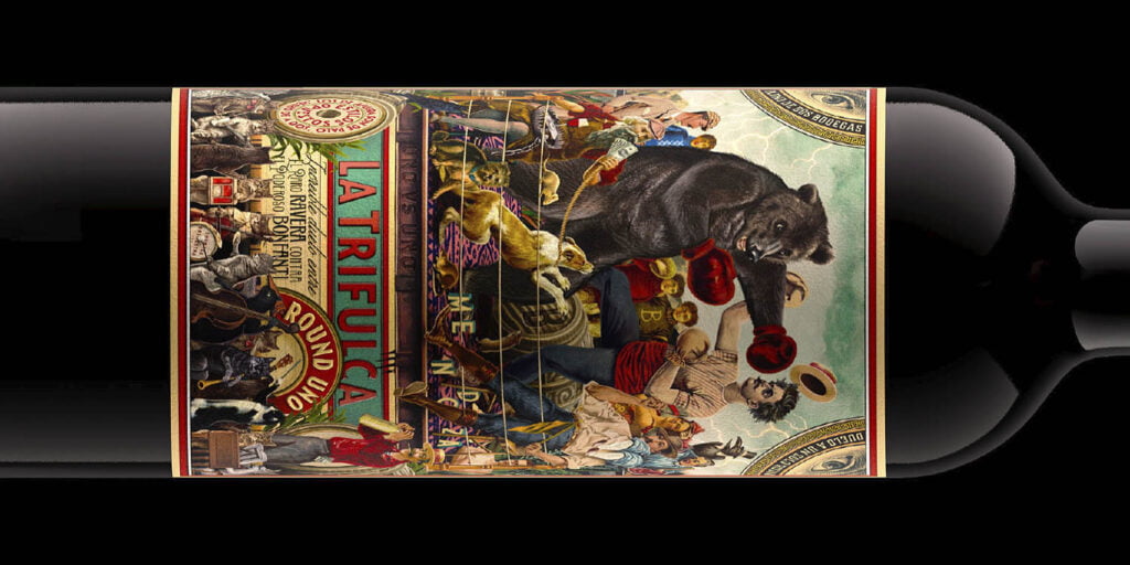
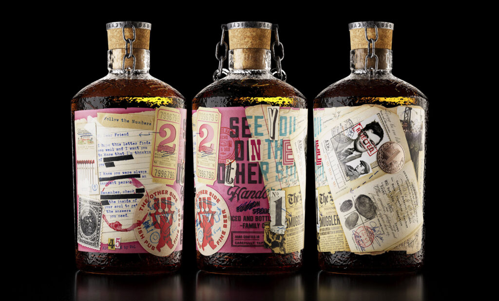
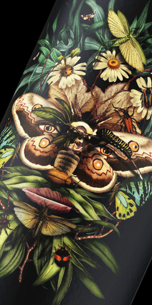
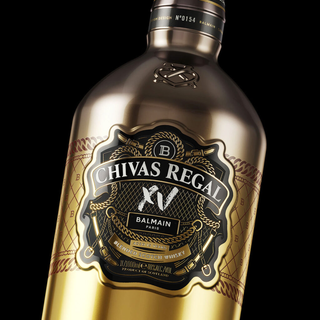
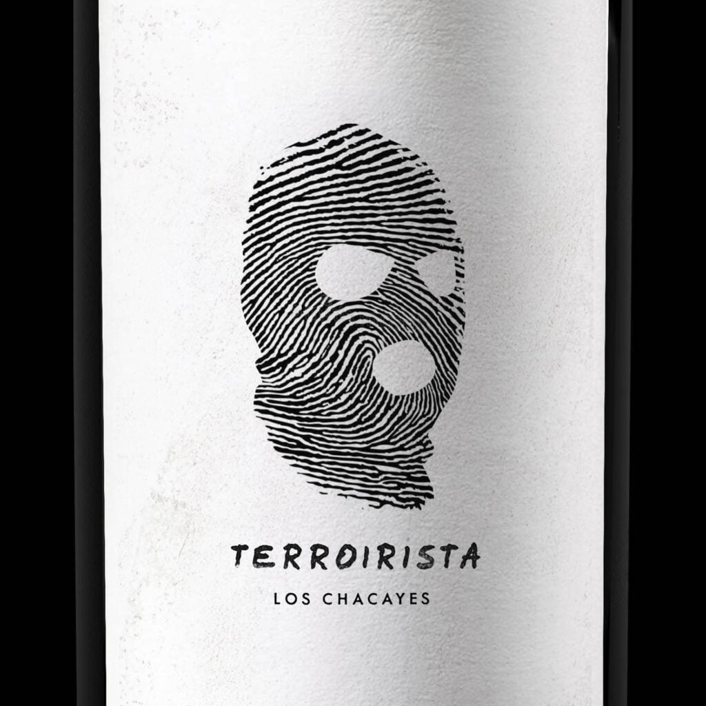
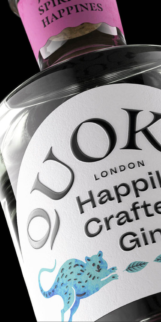
Merle Gin’s label design captures the urban spirit of Buenos Aires—“the city of fury”—where this craft gin is distilled in micro batches. The packaging blends bold typography and modern illustration to reflect the city’s vibrant energy and complexity. Designed for gin lovers and design enthusiasts alike, Merle’s handcrafted visual identity stands out on the shelf with strong branding and local character. An excellent example of premium gin label and packaging design rooted in place and personality.